Digital clock using JavaScript, CSS, HTML
<!DOCTYPE html>
<html lang="en">
<head>
<meta charset="UTF-8">
<meta http-equiv="X-UA-Compatible" content="IE=edge">
<meta name="viewport" content="width=device-width, initial-scale=1.0">
<title>JavaScript clock</title>
<link rel="stylesheet" href="st.css">
</head>
<body>
<div class="clock">
<div class="hour">
<div class="hr" id="hr"></div>
</div>
<div class="min">
<div class="mn" id="mn"></div>
</div>
<div class="sec">
<div class="sc" id="sc"></div>
</div>
</div>
<script type="text/javascript">
const deg = 6;
const hr = document.querySelector('#hr');
const mn = document.querySelector('#mn');
const sc = document.querySelector('#sc');
setInterval(() => {
let day = new Date();
let hh = day.getHours() * 30;
let mm = day.getMinutes() * deg;
let ss = day.getSeconds() * deg;
hr.style.transform = `rotateZ(${(hh) + (mm / 12)}deg)`;
mn.style.transform = `rotateZ(${mm}deg)`;
sc.style.transform = `rotateZ(${ss}deg)`;
})
</script>
</body>
</html>
CSS FILE
* {
margin: 0;
padding: 0;
box-sizing: border-box;
}
body {
display: flex;
justify-content: center;
align-items: center;
min-height: 100vh;
background: #091921;
}
.clock {
width: 350px;
height: 350px;
display: flex;
justify-content: center;
align-items: center;
background: url(clock.png);
background-size: cover;
border: 4px solid #091921;
border-radius: 50%;
box-shadow: 0 -15px 15px rgba(255, 255, 255, 0.05);
}
.clock:before {
content: '';
position: absolute;
width: 15px;
height: 15px;
background: rgb(19, 17, 17);
border-radius: 50%;
z-index: 10000;
}
.clock .hour,
.clock .min,
.clock .sec {
position: absolute;
}
.clock .hour,
.hr {
width: 160px;
height: 160px;
}
.clock .min,
.mn {
width: 190px;
height: 190px;
}
.clock .sec,
.sc {
width: 230px;
height: 230px;
}
.hr,
.mn,
.sc {
display: flex;
justify-content: center;
/* align-items: center;*/
position: absolute;
border-radius: 50%;
}
.hr:before {
content: '';
position: absolute;
width: 8px;
height: 80px;
background: #073c5a;
z-index: 10;
border-radius: 6px 6px 0 0;
}
.mn:before {
content: '';
position: absolute;
width: 4px;
height: 90px;
background: #111110;
z-index: 11;
border-radius: 6px 6px 0 0;
}
.sc:before {
content: '';
position: absolute;
width: 2px;
height: 150px;
background: #8350e0;
z-index: 12;
border-radius: 6px 6px 0 0;
}
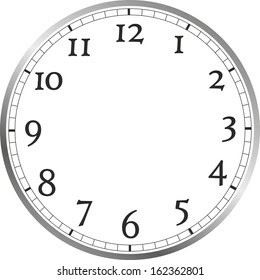
Clock Image:


Comments
Post a Comment